I chose to analyse this digipak as it is Arctic Monkeys (the band that originally performed our song) most recent album.
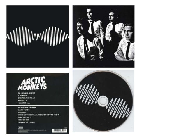
The thing that I noticed almost immediately was the black and white theme that follows through the entirety of the digipak. This, and the shirt and ties the band are seen to be wearing, creates a classic,retro vibe, and gives us a sense of what the album will sound like.
The minimalist icon of the sound wave with 'AM' in the centre, establishes an indie stereotype- not caring about anything but the music. The fact that the only thing on the front cover is something that represents 'sound', is massively important- the people in the band aren't the face of Arctic Monkeys- their music is.
I researched the rest of Arctic Monkeys digipaks, and the only one that has a continuous monochrome theme was their debut album, 'Whatever People Say I Am, That's What I'm Not,' and I think that this colour schemes return in their latest album suggests a return to their roots.

This promotional poster (that was released before the album), is also incredibly minimalist, and this would have suggested to their band's fan what kind of concept they were going to follow before releasing anything else.
Comparing this digipak to others, it reminds me a lot of the 1975's self titled album.


No comments:
Post a Comment